I'm an architect at ARCSPACE STUDIO and I'm thrilled to have this platform by which I can share our process with you via the "we shape space" blog and share interesting ways in which architecture connects to us via the ArchitectureConnection blog!
“Architecture is like frozen music, and the role of the photographer is to make it sing.”
Ezra Stoller, Photographer
Early on, a vision of the architect’s project begins to jell. The design process is all about developing and documenting that vision so that it can ultimately be translated into built form. At least for me, the vision includes not only the building but its contents as well. In many cases, the owner develops a very different vision and furnishes the house in a way that taints the architect’s perceptions. (Perhaps another example of arrogance on the part of the architect, but it remains true)! This discrepancy in visions may explain why, in some cases, the architect chooses to photograph a project before it is furnished. In other cases, the visions are in closer alignment and the architect chooses to photograph the project after it is furnished. A well-appointed house enhances the architecture, and good photography can capture that. Great photography goes even further, by capturing the house’s underpinnings, or what Francis DK Ching calls “form, space, and order”.
Higher Perspective photograph of the dinky House
The contents within the house area referred to as FF&E (furniture, fixtures, and equipment) and are typically outside of the scope of the architect’s work. Owners and/or interior designers are the ones who normally deal with these things. I once heard FF&E explained this way: If you pick up a finished house, turn it upside down, and shake it, whatever falls out is the FF&E. The part you’re shaking is the architecture.
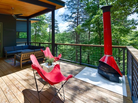
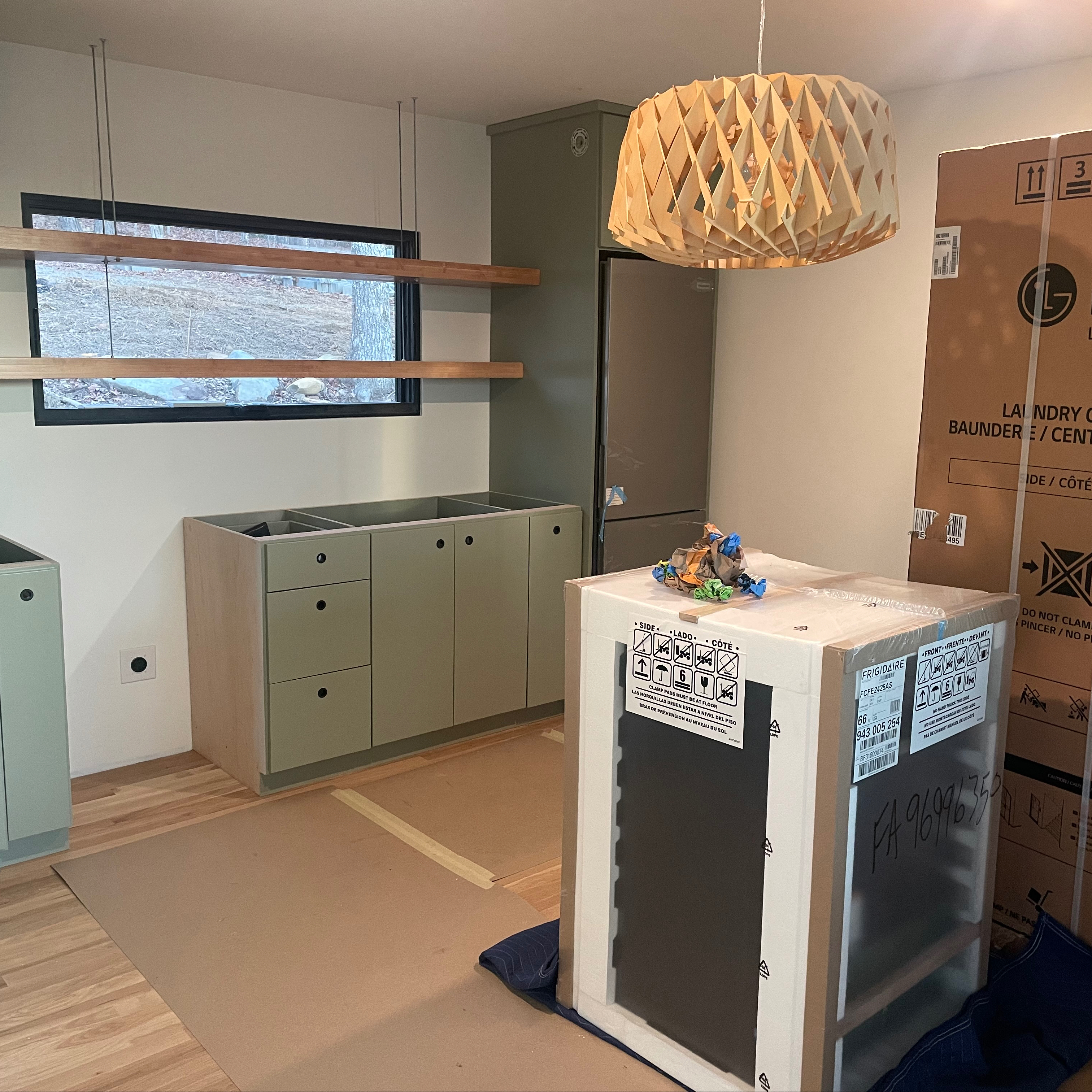
In the case of the dinky, most of the FF&E was new, since we didn’t move. We still live in the BirdHouse during the week. So, Susan and I (but mostly Susan) spent months collecting furniture and furnishings. We also seized the opportunity place a couple of classic pieces that had been gathering dust for decades. One was a fire-engine red funnel fireplace that Susan won in a raffle in the 70s, which was converted to a chiminea and now sits proudly on the deck. Another was a recently restored classic Dr.Pepper machine salvaged from my grandfather’s welding shop, for which I carved out a niche near the stair. I modeled these things and placed them, along with the other furniture, in my house model so we could visualize various options and scenarios. When designing any custom house it is important to make sure the furniture works. In a small and efficient house, it is especially important.
Dr. Pepper machine
fireplace
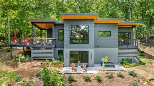
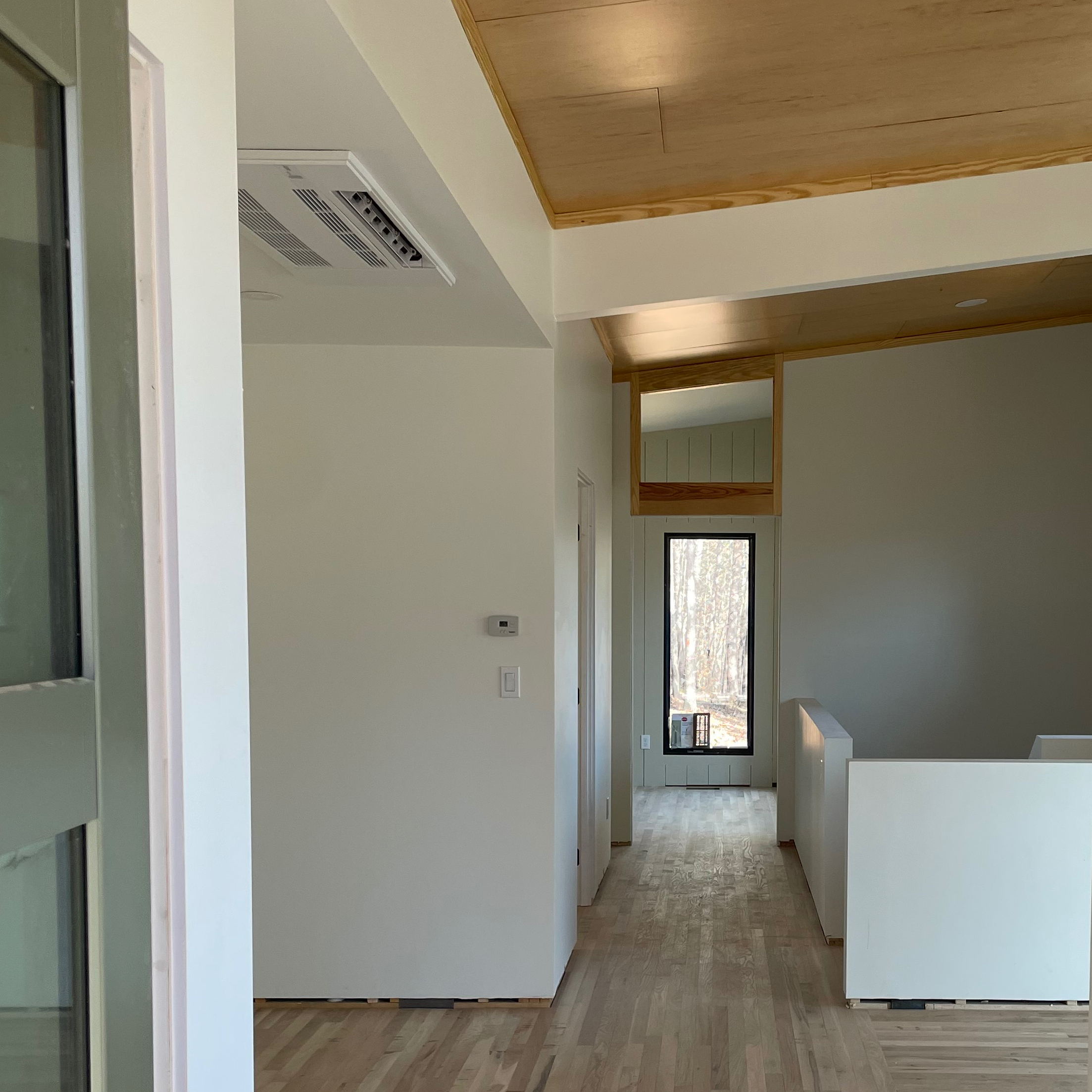
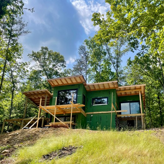
Assuming you want your house photographed, deciding when to do it is tricky. You will probably think “once it’s finished”, but when is that? I would contend that all projects, the dinky included, are never really finished. There is always a dangling punchlist item that was not checked off, or a piece of furniture to add, or some artwork to frame and hang. At some point, however; even though it’s not completely finished, it’s finished enough! At the dinky, that time was summer. I hired Urban Lens to photograph the interiors and Higher Perspective for drone shots of the exterior. We’re quite happy with the results. I think they show the house well, and give the viewer a pretty good sense of the spaces. Interestingly, they also make the house look larger than it really is, and than its name suggests. Ah, the magic of photography!
FrontKitchenBack PatioUrban Lens photograph of Main Living Space
The kind of project that we originally embarked on may have reached a point where the house is photo-ready, but it will take more time for the site to reach the same point. In the last few months our focus has moved back toward site improvements. In addition to landscaping, we’ve been thinking about the benefits that a small carport would offer. Primarily it would provide shelter for an EV that Susan has been eyeing. It could also provide a convenient place to store yard tools. If sited at a lower elevation than the existing parking area, it would to allow a more accessible path to the dinky. What I’ve dubbed the dinkier carport is now in the preliminary design stage. I suspect that we’ll come up with other “necessary” improvements along the way. In other words, the dinky project is not really finished, and may never be!
THE dinky CHRONICLES, on the other hand, are finished!
dinkier Carport
BONUS Material:
I began THE dinky CHRONICLES in January of 2023. This, the final post, is being published in December of 2024. The design and construction, at least for our original scope of work, is now behind us. We have experienced weekend living in this cabin, on this site, in all four seasons. The verdict is out, and we love it!
As established in the initial issue of THE dinky CHRONICLES, Prequel: AN ORIGIN STORY, the dinky House is, at its core, a fishing cabin. The architecture of the dinky was inspired both by this function and by its river-focused site. The Little River is a wild river and the fish in it have not been stocked. They are native. The redeye bass, for example, have inhabited these waters for millennia. In short, they belong there. I catch them, appreciate them, and then I let them go. I want these beautiful and unique fish to remain for future inhabitants to the dinky – my grandchildren, and theirs.
“A doctor can bury his mistakes but an architect can only advise his client to plant vines.”
Frank Lloyd Wright, Architect
The Architect and the Owner are often given the benefit of the doubt during construction. Curious neighbors may say, “What is that framing on the side of the house all about?” Relatives may ask “Are you really going to leave it painted black?” After construction, however, the juries begin to render their verdicts. If the architect’s vision is wonky, if the program is too restricted by owner, or if the contractor is not up to par, this is where it will all become evident and you may be forced to plant vines! I like to think that vines are not necessary on the dinky House!
Dec. 2023 – “Ready or Not” Move In
Whew! This is the final post following the construction administration phase – the time following it to the point of “substantial completion.” The last post, Seeing the Light, took us right up to the 2023 Christmas season. The original construction schedule had us scheduled to be complete by the end of October, and I had taken off the week between Christmas and New Year’s for the move in. As October drew closer and we still had a good ways to go, I was forced to go back to the bank and tell them I needed an extra couple of months. This happens …. a lot. By the time Christmas arrived, project completion was close enough that we opened our presents, ate our dinner, woke up the next day and started the move in. The appliances had not been installed, we still had a little tile left, the shower door had not been installed and the final punchlist had yet to be written. We also added a concrete patio leading from the Dormitory. This was a “change order” that I presented to Phil late in the process.
Jan. 2024 – Rear Patio
Dec. 2023 – Tile Splashes
The countertops had just been installed, so the tile setter was working around me as I was putting together furniture in the middle of the Living and Dining area. The glass guy slipped in and installed the shower door. Susan kept busy cleaning the place, which is something that is usually subcontracted. Susan had been ordering furniture for months and storing it in our garage and a small rental storage unit nearby. Susan knows that I actually enjoy putting furniture together. She blessed me with plenty of enjoyment, We kept busy from the crack of dawn to the dead of night for the remainder of my “time off”. The transformation was pretty amazing.
Jan. 2024 – Move in mostly complete
Time for me to generate a belated punchlist. A punchlist is simply a room by room listing of all the things that are not complete, not working, or not to the level of refinement that should be expected. Ideally, the architect would do the puchlist when the builder thought he was substantially complete. Once all the punchlist work was completed, the owner could begin the move in. My punchlist was relatively short, partially because we did a lot of it ourselves during that week. I actually like doing things like installing door hardware, toilet accessories, and that kind of thing.
There are a couple of other things pertaining to construction administration worth mentioning. During the course of the dinky House construction, because of my dual archictect/owner role, I was at the jobsite a lot! Sorry, Phil! In my day-to-day role as just the architect, I usually visit a jobsite just enough to stay abreast of the progress of the job. That’s normally a couple of hours every other week, but sometimes more, depending on what is or is not happening. I’m there to provide another perspective for the owner and to make sure that the vision I documented on paper ends up in brick and mortar. We call these visits “field observations” and not “inspections”. It is not the responsibility of the architect to catch every mistake the builder may make or to tell him when and how to construct the project. The means and methods are up to the builder. I normally spend whatever time is required to carefully look over the jobsite, alert the builder to any deviations from the contract documents that I encounter, answer any questions the owner or builder may have, and gauge the progress so that I can make sure that the owner and I have decisions made so as not to impede progress. I normally follow these visits with a Field Observation Report. Depending on the agreement, I often review the builder’s pay request to make sure they are in line. The builder is fairly entitled to be compensated promptly for work completed and for necessary material deposits, but should not request funds for work not completed. There are rare occasions when a builder is borrowing from Peter to pay Paul. Architects also make sure that a project is closed out correctly – punchlist completed, warranties turned over, and liens releases are signed. The architect is also coordinates change order to make sure they are fair and equitable. Spread out over the course of construction, there is quite a bit of effort in this phase, which is why it is normally about 25% of the total architectural fee.
So, back to the dinky House. It seems like we were finally finished, but were we really? That question will be answered in the final issue of the dinky Chronicles. Join me next month for Never Really Finished.
BONUS Material:
In the summer of 2009 my youngest daughter was preparing for college. She and our other daughter, already in college, decided that Susan needed someone other than me to nurture. Specifically, they felt she needed a puppy. The girls hounded Susan for weeks (pun intended) until she caved. My only responsibility with the new puppy was to name him, which I did, after the legendary architect LcCorbusier, or Corbu for short. I anticipated that Susan would fall hard for the cute little puppy as he peered out from his tiny crate. What I did not anticipate…. was that I would too.
Corbu quickly took over the house, then he claimed the yard. He also commanded a roving boundary, within sight or earshot of Susan. She knew him best and was the first to channel his often random thoughts, although I quickly learned the art as well. Susan was the Momby and I was simply Dad. Anytime we left the house, Corbu would jump in his crate, knowing that we might take him with us. We often did. He was the best traveler of all the children. He was so quiet that sometimes we would look in the crate to make sure he was still there. Of course he was, but he would occasionally slide under his bedding, as if he had disappeared – the Amazing Corbini!
Ruler of the House
Protector of the Yard
Corbu loved to play. He would take squeaky balls to the top of the stairs, drop them, then go chase them down. If he was downstairs and Susan or I squeaked a ball upstairs, he would immediately run up and grab the ball with his mouth. He could tell them apart by their squeaks! Even though he never reached his goal of 12 pounds and had to take ten steps to match my one, he loved to “go for the walk”. Rarely did a day pass that we did not roam the neighborhood together. Neither wind nor rain nor dead of night could stop us from our appointed rounds. He was a really clever dog and could navigate the neighborhood well, and even turn for home when he started to get winded. Corbu liked to explore and go on hikes with us. One of his last was to the property where construction of the dinky House was about to begin.
To our great sorrow, Corbu died unexpectedly during the Summer of 2022. We had anticipated he would be laying claim to another place, but it was not to be. It did not feel right for Susan and I to be enjoying the dinky without his presence. We decided to commission a pop art poster and gave it the most prominent spot in the house. I know it’s weird, but It seemed right. It’s our tribute to the best dog ever!
“The phrase the light at the end of thetunnel is a metaphor used to refer to signs that a long period of adversity is coming to an end.”
-David Wilton, Author of wordorigns.org
Photo credit: Great Western Railway, 2017. in Switzerland
Perhaps no other metaphor better describes project completion. The journey is long and the turns are many. There are long uphill inclines and treacherous decents, but at some point…the process ends. For most, getting to the rough-in phase represents the journey, but once the rough-in phase is complete, they can at last begin to see the light at the end of the tunnel, even though it is still a long ways off. Regrettably, the light cannot be reached without going through the finish stage. Just as with the earlier phases of constuction, the fits and starts continue throughout this stage as well.
Finish work includes a long list of tasks. Fortunately many are not on the critical path, which helps things move along. In general the tasks are very similar from job to job, so I will run through the tasks completed at the dinky house. Hang with me. There’s a lot!
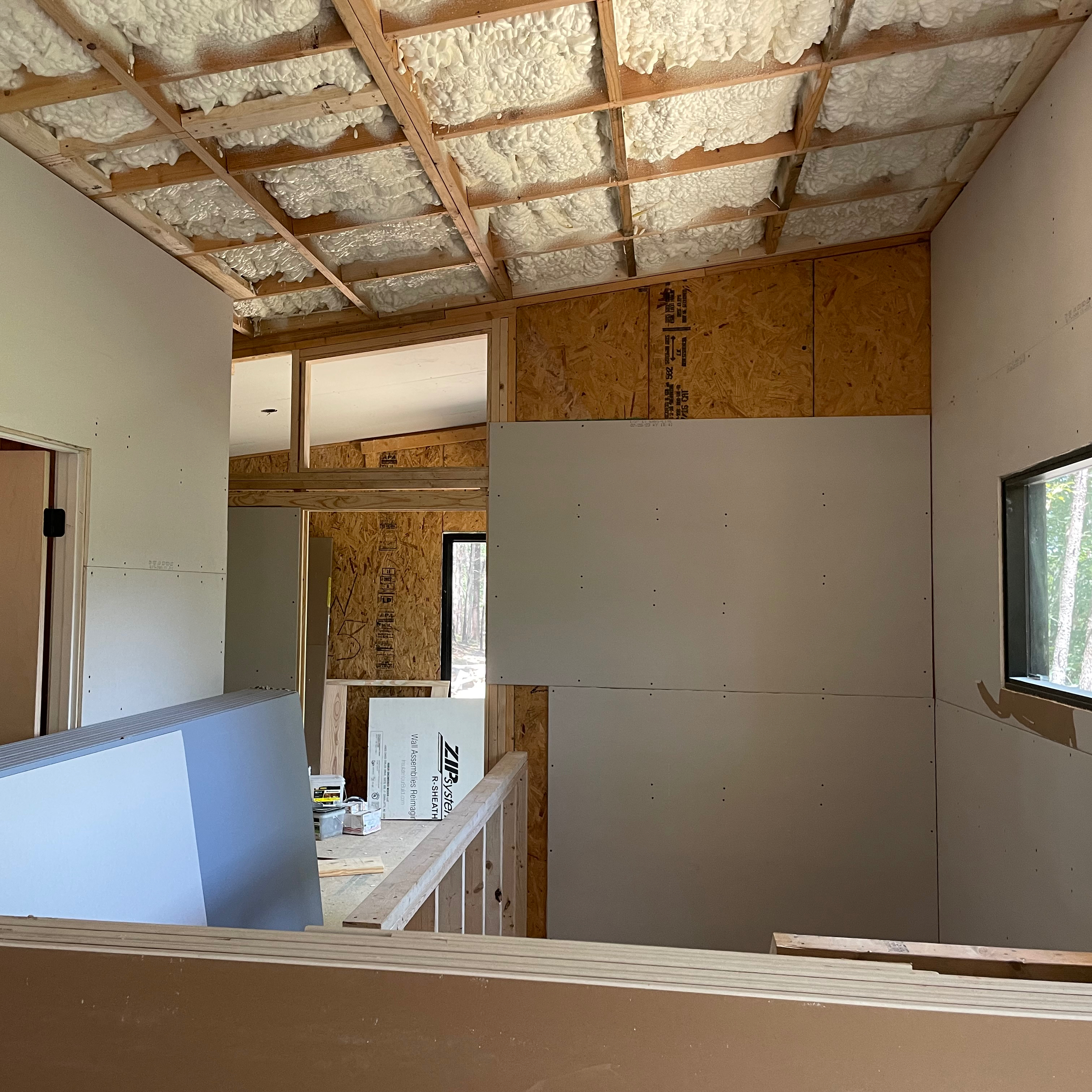
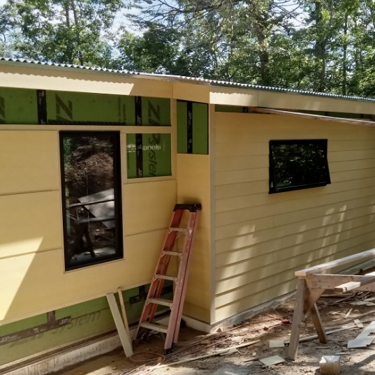
With all the rough-in work completed and the insulation installed, the drywall hanging was next up. Normally drywall is rough hung with gaps at the floor level and around the windows. Baseboards and window casing cover that gap….typically. I designed the dinky with precious little trim. The drywall work required a little more attention than it usually would but that’s somewhat offset by the fact that there was no casing and crown moulding to deal with. Just before the hanger finally got to us, he and his guys all contracted COVID. This pushed his already busy schedule back ever further. After burning through the first half of August 2023, Richard and Hunter ended up doing the drywall hanging, primarily so they could install the doors. This was a critical path task, so it was a relief to have it behind us. In the midst of the hanging, the tile setter showed up to install the cement board and prepare for the tile installation. Since August was fairly dry, work also progressed on the exterior. My guy installed the septic tank and drainfield, as well as four rows of drain line, buried in pea gravel, on the uphill side of the house.
Richard and Hunter switched back to the exterior to finish the siding and plywood ceilings, then to the inside to install wall paneling in the Primary Bedroom accent wall and the Foyer. They also installed the plywood ceilings in the vaulted areas. Game changer! Squeezed in between, the drywall finisher did his taping, mudding, and sanding. By the time September rolled around, both the interior and exterior were far enough along to start the painting of the exterior siding and the staining of the plywood ceilings. Painters also applied the tinted primer coat to the drywall ceilings and walls, allowing the electrician to install fixtures and ceiling fans. This work took us through September and well into October of 2023.
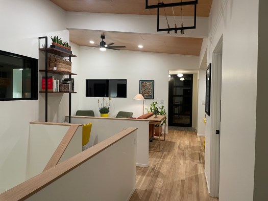
I’ve always loved classic strip oak floors, sanded and finished in place. Before installing this type of flooring, it is important that the HVAC is operating, so the boards can climatize. The mechanical contractor had little to do in the finish phase other than to physically install and connect the mini-split units. All this was done shortly after the painting. Once the flooring arrived, the dinky was in the middle of the acceptable temperature and humidity range. In addition to the flooring, the parapet wall caps surrounding the stair, the stair treads, and even the handrails were all fabricated from white oak. The finish we decided on was a product I had never used before. It was a penetrating finish, only slightly shinier than the raw floor, and lacked the slick feel of polyurethane. I think the matte finish looked great and I like it even more as time passes. The light filters in without the mirror effect of high gloss urethane. And with the completion of the wood floors, went the remainder of October.
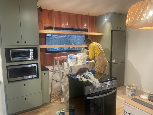
November brought both periods of rain and periods of sunshine. Susan and I continued to spend our weekends laboring in the increasingly brisk outdoors. We built gabion planter retaining walls, had our guy install them along the uphill portion of the house, where Susan and I filled them with rocks and plant material. We also planted numerous trees and shrubs to ground the house and provide some erosion control. The rains revealed where the drainage issues were. Enter shovel, wheel barrow, rock, piping, and a sore back! Inside the dinky, Richard was ready for the cabinets and probably beyond ready to free up his shop space. He carefully installed the cabinets over the newly finished wood floors. We were really happy with the painted green look. I was especially happy with the drilled and grommeted “pulls” and the chunky floating shelves. The cabinets arrived along with Thanksgiving! I always caution my clients that very little construction takes place between Thanksgiving and New Years. I hoped the dinky might be an exception, but alas….it was not to be. The electrician did manage to install the light fixtures and the tile setter completed the shower and tub.
By the beginning of 2024 we were “in the short rows”. The light at the end of the tunnel was getting brighter! We’ll delve into that next month, when we confront the remaining tasks, go through the punch list, and get through the tunnel. Join me for “Whew!”
BONUS Material:
The first episode of the Dinky Chronicles contained bonus material explaining the origin of the “dinky House” name. The surrounding area was used to mine coal in the early 1900s, then as a hunting destination (the “subdivision” in which the dinky House is located is called Hunters Ridge). In 1928 Lookout Mountain Camp for Boys opened and ushered in a new type of destination – the Camps. Lookout Mountain Camp is still in operation. We can literally walk a half mile down the dinky line and walk directly into the camp. By 1950 several camps called the area home, each appealing to a different type of camper.,
A sign along the highway in nearby Valley Head
After noticiing a couple of camp pennants in the Mentone Market, we decided this would be a great way to decorate “the dormitory”. It’s a little nostalgic for me, since my childhood bedroom was covered in pennants, of all the teams that beat my beloved New Orleans Saints,….but back to my point. The dormitory was designed with our grandchildren in mind and the pennant idea stuck. Susan sought out pennants from the surrounding camps. Since the dinky house now has a little slack line play area, some floats, a kayak, and lots of fly rods, we decided we could run our own unofficial camp for our little campers. I dubbed it Camp dinky and went to work designing a pennant for our camp!
“What I try to do is the art of building, and the art of building is the art of construction; it is not only about forms and shapes and images.”
–Peter Zumpthor, Architect
Peter Zumpthor in his Studio in Switzerland
Peter Zumpthor is both a visionary and a practical architect. He understands that architecture is a practical art. A house is not just a piece of sculpture, nor is it simply shelter. although it must serve the physical needs of the users. The obvious physical needs to be served include provisions for eating and drinking, personal hygiene, sleeping, and exercise. Others include items of comfort such as thermal comfort, acoustics, and indoor environmental quality. The primary systems used to address these needs are plumbing, HVAC, and electrical, and they are installed in two phases. As soon as the house is dried in, the first of these phases commences; the rough-in.
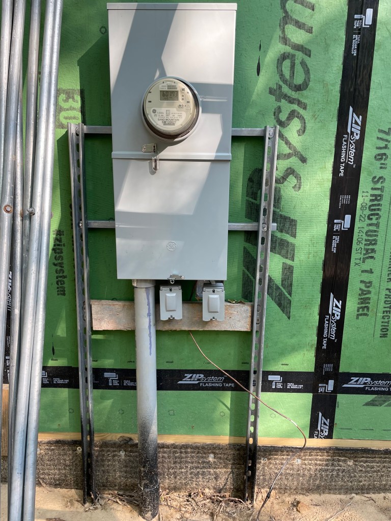
main power to meter
The sitework contractor normally runs all of the utilities from the utility company connection point to within ten feet of the house. The plumber, mechanical contractor, and electrician pick them up from there. The site utilities are normally run early in the construction process and are in place when the rough-in work begins. One common exception occurs when city sewer is not available, such as on a rural site. In such a case, a septic tank and drainfield are required. There are other exceptions of course, such as when the house is “off the grid”. In the case of the dinky, we did not have city sewer but we were on the grid.
Rough-in is a rare series of events where multiple subs can work simultaneously. The first of the rough-in subs to the jobsite has the advantage of running their system of piping, ducts, or wiring without having to work around the systems of the others. Occasionally the rough-in subs are all there at the same time. I’ve seen that happen on some of my projects, but not so much at the dinky house. As summer approached, construction continued to move at the speed of Jello! (Editor’s note: My cynicism is not really warranted, since I was well aware that Phil worked the dinky project into his busy schedule.)
The HVAC sub was the first to arrive in early June 2024. Most of the houses in our region of the country utilize forced air systems, but mini-splits are becoming more common. With no attics to run ducts, its whisper quiet operation, and its uber efficiency, mini-splits made perfect sense for the dinky. The use of SIPs meant that I could heat and cool the whole house with just a couple of tons. The rough in was pretty straightforward. They set the outdoor units (condensers) and ran the line sets to where the indoor units (air handlers) would eventually be. The plan called for one unit in the basement, a slightly larger one in the dining area, and one in each of the bedrooms. In a really tight house it is really important to vent it well. With an ERV bringing fresh air in and whisper quiet exhaust fans taking stale air out, we were able to maintain good indoor air quality. One “trivial” thing I want to mention. I walked into the dining area one day and noticed they located the controller smack dab in the middle of the wall, just like they always do. I had them relocate it, to the location along the edge indicated on the drawings, just like I always do.
mid June 2023: ERV in crawl space
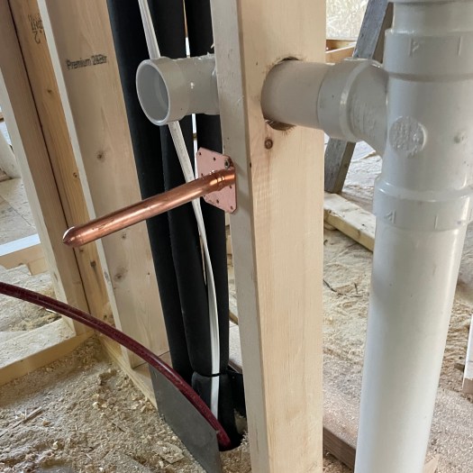
early June 2023: Line sets, PEX supply, PVC waste
The electrician was part-time, which was a concern only for a very short period of time. He installed the panel and started pulling wires right away. He worked evenings and weekends to set the boxes for lights and plugs, except for those that were embedded in the SIPs. He easily kept pace with the other rough-in subs.
During this phase there was still work for the carpenters. They installed a weatherproof membrane on the roof deck, followed by roof panels. I’ve always admired old barns with roofs that sport deep corrugations and pronounced shadow patterns. Who knew they would be so difficult to find! Normally there would be a dedicated roofing crew for this work, but I had all of the panels cut to length and roofing crews were backed up, so Richard and his sidekick Hunter just knocked it out themselves. A recurring theme. They also managed to do all the miscellaneous work required to keep the rough in moving, such as adding blocking for accessories and installing the rigid foam insulation against the CMU walls in the basement level.
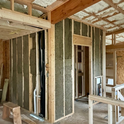
metal rooffiber cement siding
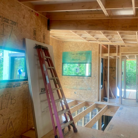
Once the rough in was officially complete, the roof/ceiling assembly was ready to insulate. In this case it was sprayed with open cell foam. This completed the sealing of the building envelope. I then took my iPhone camera and walked room by room through the entire house, taking photographs of every wall, in case I ever need to know where any of the rough-in components are located. (I have already had the need to reference these photos, twice.) Now it was time to call in the ultimate craftsmen to perform a truly precision task. Yes, it was time for Susan and me to stuff mineral wool sound batts into the interior wall cavities. The simple purpose of this task was to make the rooms quieter. We managed to complete this task in a weekend….or maybe two. With everything in the walls and ceilings, it was time to cover it up. Next on the list was hanging drywall and installing paneling; but, that and more is a story for next time, when we explore Tunnels & Lights.”.
early August: roof/ceiling insulation and sound attenuation
BONUS Material:
For most of us middle class kids growing up in the disco era, acquiring furniture and furnishings started out something like this. Your generous relatives would give you a bunch of “heirlooms” and other stuff that they wanted to get rid of thought you could really use. Then you might go to town and buy something special from the furniture store – maybe a sofa, or a dining table, or maybe even a bedroom suite. Whatever else you needed came from Sears – the anchor store in the mall, not the little outlet in the strip center.
Now we have more choices than the Sears good, better, or best lamp, although I still think shopping local is a great option. Nothing beats putting eyes on the product. I also understand that there are other really good options. One can go on to the internet and search from thousands of lamps, to suite any taste, at various price points. This is a double edged sword, since there are a whole slew of really bad lamps out there, and you may not appreciate that until it arrives on your porch. Fortunately we were able to avoid that scenario in the case of furnishing the dinky. A ton of credit goes to Susan’s well honed shopping skills, but we’ll get to that later.
“The Sun does not realize how wonderful it is until after a room is made.”
–Louis Kahn, Architect
Phillips Exeter Academy library by Louis Kahn
The colorful Louis Kahn was a pioneering architect and professor. I might add the label of poet, for the way he explained subliminal aspects of architecture. As we’ll discover, even in architectural masterpieces like the Exeter Academy, the construction started out as fairly mundane. This is something made evident in the first of the CA posts, Out of the Ground. An assortment of materials slowly rise from the site and begin to take form. At some point, that form begins to take on life, and the users begin to understand the spaces contained by the forms. For most owners of custom homes that moment occurs when the house is finally “in the dry”. Just as a plant emerges from the ground in a fairly mundane way, it eventually reaches a point where it blooms, and becomes a flower. In the case of both the house and the flower, the catalyst is the sun. This month’s issue addresses that timeframe (of the house, not the flower)!
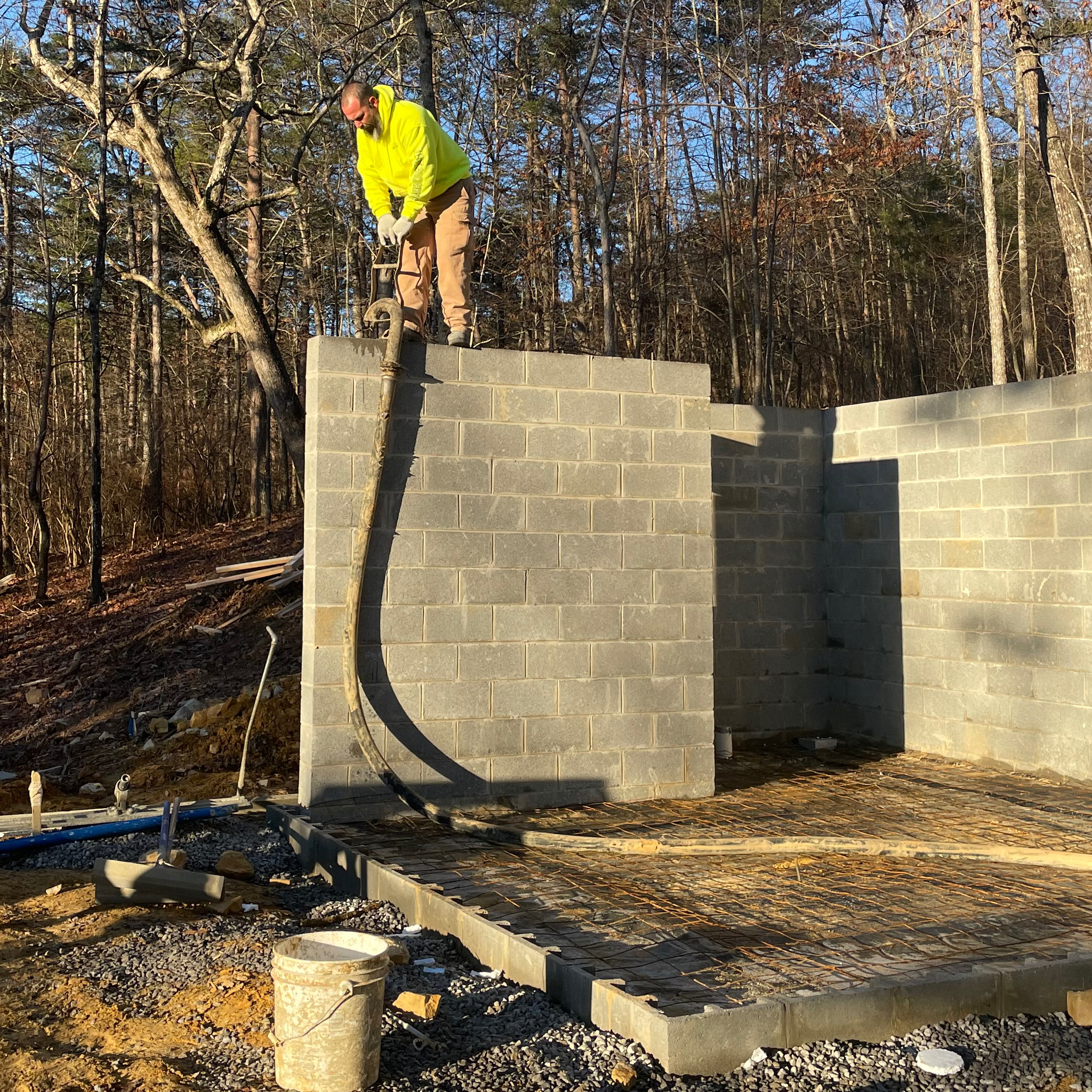
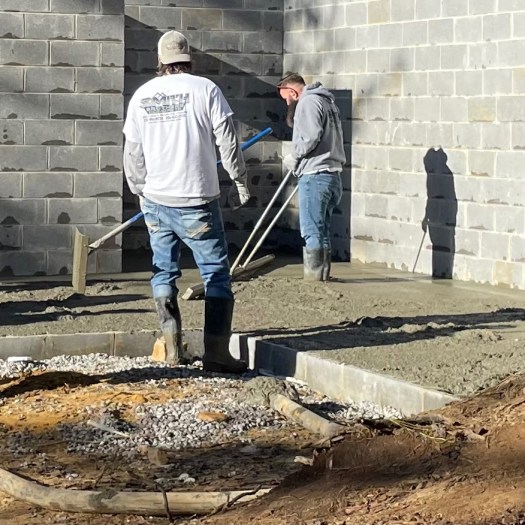
We left the dinky House last month with concrete block walls rising from the poured concrete footings. Shortly after that came the Christmas holidays, followed by a January of rain. During the occasional breaks in the rains, the project crept forward. Be warned: Construction is a maddening series of fits and starts! Since the concrete blocks were designed to hold back the grade surrounding the daylight basement, they had to be poured with concrete and reinforced with steel rebar. The “dormitory” area opened directly to grade, so the floor construction was concrete. Phil, our builder, called in a pump truck and a concrete truck to tackle both of those tasks at once. With the concrete block walls and slab finally poured and reinforced, it was almost time for framing; however, there was one minor task in the critical path blocking the way: the concrete walls had to be waterproofed and backfilled. An easy task, were it not for the rain! The block would almost dry out, then more rain would fall. Soon February was gone. See what I mean, maddening!
Early Feb. 2023 – filling concrete block
Early Feb. 2023 – working the slab
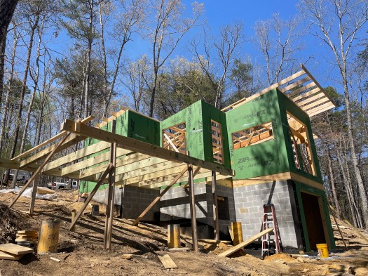
The dinky house used SIPs (structurally insulated panels) for all of the exterior walls. Think of it as a material sandwich: foam insulation between two sheathing panels. SIPs are very strong and provide a really efficient wall, with high thermal resistance and very low air infiltration. They are made offsite in a controlled environment but can be erected on-site quickly, decreasing the time it takes to get in the dry. At the dinky house, all of the main floor exterior walls were SIPs. A little stretch of the basement wall, those not holding back grade, were also SIPs. These basement panels were quickly erected, allowing Phil to begin putting down floor joists and attaching subfloor. After a couple of days, the SIP installation commenced on the main floor. That took a couple of days as well. Once the SIPs were in, that took car of the exterior framing, sheathing, insulation, outlets and conduits. Not bad.
Late March 2023 – SIPs erection begins
Early April 2023 – SIPs , floor and roof framing
To get in the dry, there was still some interior framing to address, all the windows to install, and a roof to cap it off. Most of this landed on Phil’s key guy, Richard. I’m not sure what job description to assign to Richard. On my project he was a framer. window installer, siding installer, roofer, drywall hanger, finish carpenter, and cabinet maker. In a day and age where it’s hard to find anyone without tunnel vision for their own particular task, it is refreshing to see someone who can do it all, and do it all well. To get in the dry as quickly as possible, the bearing walls were erected first, so that the roof could be installed as soon as possible. Of course, the remaining interior walls needed to be installed as well to clear the way for the rough-in work. Everything builds on something else. There were plenty of dry-in tasks to keep Richard and his sidekick, Hunter busy through the month of April and well into May. By the end of May, we were finally dried in. The sun shone through the forms, making spaces!
May 2023 – interior framing near completion
Late May 2023 – In the dry!
BONUS Material:
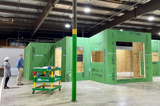
I have long been interested in SIPS, but there were a couple of perceived drawbacks that kept me from using them on any of my projects. First, I was unaware of any nearby manufacturers. Second, I had only known of them being installed using a costly crane. Third, I was bothered that the sheathing had to be covered inside and out with more sheathing, which seemed like kind of a waste. The last reason was simply that they added too much cost. I’m now convinced that between the offsets, the future energy savings, and the resiliency of the system, that SIPs is a good value, Most of the convincing came from a sole source.
A few years back, I met a gentleman named Rob Clutter, at the annual Home Builders Show in Huntsville. He was with a company called EcoPanels of Tennessee, which was only 120 miles from the dinky House and 180 miles from my practice in Huntsville – same day delivery! There were a couple of things that made his Eco Panels unique. They were fabricated in 4 foot widths, cleverly fitted together, and could be easily installed by the framers, without a crane (at least for the wall panels). In addition, Eco Panels could be sheathed with either Zip panels or OSB. By using zip panels on the exterior we could eliminate the redundant sheathing. I also reasoned that if the exterior SIP walls were all erected, they would establish variations in plate height and make the interior walls much easier to gauge and erect. Using SIPs forces one to plan the power and lighting outlets prior to fabrication. That might be a problem for some, but not for me. All of these details were worked out early on, with shop drawings. About a month after the shop drawings were completed, Rob arranged for me and Susan to visit the plant to see the dinky House dry-fit. That was exciting!
Jan. 2023 – Dry fit of the dinky.
Rob was a great guy to work with. He believed in the benefits of his product and represented it honestly. He had respect and praise for his colleagues who figured out the details and fabricated the panels. He came to the dinky jobsite and gave Phil and the framing crew a crash course in erecting the panels, then hung around until the crew was confident. He was on the other end of the phone line when questions arose, which happens when inquisitive architects are involved.
I learned only recently that Rob passed away unexpectedly while on a jobsite, just a few weeks ago. It was an emotional blow to everyone who knew him – his close family, those who worked with him, those who worshipped with him, and even the customers whom he served. Rob wore a white hat, and he will be sorely missed.
“You can dream, create, design, and build the most wonderful place in the world. But it requires people to make the dream a reality.”
– Walt Disney, Visionary
Architecture differs from other art forms in many ways. As discussed in the Procurement post, architecture usually requires the use of someone else’s money. I would add that it also takes more than just the artist (architect) to bring it to fruition. It takes excavators, foundation masons, block masons, framers, plumbers, electricians, tile setters, finish carpenters, and a host of other tradespeople. And it takes someone to choreograph all of these folks – the General Contractor. In residential construction, he or she is normally referred to simply as “the builder”. Most of the time the builder is using the tradespeople that they are comfortable with and have used successfully on other projects. Sometimes, the Owner will want to use a different tradesperson, that they know, for part of the work. The builder will normally go along with it, but they will forever refer to this tradesperson as “your guy.” If anything goes awry, it will likely be because of your guy!
And don’t forget the architect. During Construction Administration, the architect serves as the owner’s representative during this phase but works closely with both the owner and the builder. In general, the architect helps to insure that the builder has all the information he needs to keep the project moving. This includes reviewing pay draws, assisting in the change order process, checking shop drawings, and observing the project. The observations are to ensure that what was so carefully documented is, in fact , constructed the way the documents indicate. The architect cannot and should not be dictating how the builder performs his job, nor should he or she be following behind the builder with a tape measure! The main purpose of the observations is to insure that the design intent is carried out. At the end of the project, the architect prepares a punch list of any minor items required to officially complete the project.
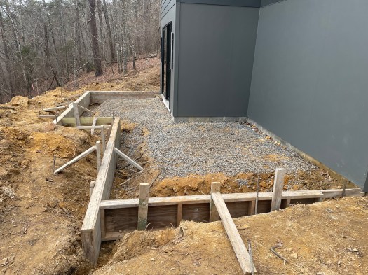
June 2022- Site Clearing
Construction begins with the site. Before meaningful work can be accomplished, the site has to be cleared for the building footprint and driveway. In addition, a “laydown area” for materials must be provided and there has to be an area to park for the workers. The surveyor normally returns to locate and flag the corners of the house and edges of the driveway, based on the drawings. Even though we do our best to get these right on paper, sometimes looking at it surveyed in the field suggests that we tweak something a bit – maybe the house slide up the hill a couple of feet, or maybe swing the driveway a little wider to save a tree. Once all this is figured out, the excavator is called to the site for some really serious work!
June 2022 – clearing of the path (viewed from top)
Normally the builder coordinates all of this, but in the case of the dinky House, I did the coordination of the surveyor and excavator, even before I officially hired the builder. In the Summer of 2022, John Lawton, my guy, cleared the building site, the driveway area, and the drainfield area. We called him back in the Fall to develop a footpath he had previously cleared across the steep incline from the dinky House to the Little River. He masterfully used the boulders he uncovered as he backed his way back up the path. creating the steps that make the path manageable.
Sept. 2022 – boulders added (viewed from bottom)
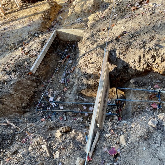
Also in the Fall we had officially hired Phil as our builder, and he took over. With the site cleared, what most think of as the actual construction can begin. Normally the excavator would move from clearing the site to digging the footings, but in our case, Phil used his guy to dig the footing and bring the utilities on site. The dinky house has a daylight basement, which obviously requires more excavation than simply digging for a crawl space. Fortunately we did not encounter any rock that could not be removed with the track hoe and soon the footings excavations were underway, stepping with the grade and reinforced with rebar along the bottoms (In bad soil conditions, the rebar are heavier or spaced more closely; sometimes additional rebar are required at the top). Luckily our dirt was good and soon the footings were ready for concrete.
Deviation: Everyone understands how dependent on the weather that farming is. Few understand that construction is as well. Among those who do are builders and their subs and suppliers. Also among them are those brave souls who have undergone the process of building their homes!
Oct. 2022 – forming/reinforcing footings
Nov. 2022 – poured concrete footings
Dec. 2022 – erection of concrete block walls
In North Alabama, the late fall and winter months tend to be our wettest of the year. 2020 was not an exception and for several weeks Nature toyed with us. To pour our footings, not only did the skies have to be clear, but the gravel road leading to the jobsite had to be dry enough so that a really heavy cement truck did not get stuck in a rut. When we got a marginal break in the weather, Phil ordered half-full trucks so that they could get to and fro. Clever.
Soon the concrete block was delivered, which was the catalyst for more strategically spaced rain. A new group of workers, the block masons, were finally able to make it to the site. They made good headway on the basement and the crawlspace walls and completed them shortly before Christmas. This was kind of a milestone – construction going vertical!
This ended 2022 and is a good place to end this post. Next we will follow the progress of filling the block, pouring the slab, erecting the SIPs panels, and the rest of the wall and roof framing. Join me in August for construction administration 2: Dried In.
BONUS Material:
When we purchased the dinky site, the trees and flora populating it were native….well, mostly. Unfortunately, some non-native species had been introduced over time. The result was that the site was really overgrown with vines, thickets, and weeds. That was not what we wanted, nor did we want a classic suburban yard, with pristine sod and manicured boxwoods. What we wanted was a native landscape, with maybe a select few adaptive plants…but not invasives!
I would suggest that there is a vast difference between an appreciation for the outdoors and an appreciation for native beauty. It is possible to appreciate what is around us, without really knowing what should be around us. Susan, who is a gardener through and through, immersed herself in the study of native plants before the ink was even dry on the purchase agreement. She convinced me that if we got rid of the invasive plants, the native plants would thrive. And, oh yeah, we might want to add some additional plants in a few places as well. One side benefit to native plants, she explained, is that they don’t require much care, since they are in tune with their environment. And so, we began our quest to reclaim the native beauty of our dinky site in April of 2022. The invasive plants fought back vigorously, and the plants we added have required considerable work to get established. Susan swears that this will lessen considerably after a year or so. I think she’s lying again!
So, what are we left with today, after hundreds of hours of cutting, digging, pulling, watering, and planting? And after decimating our landscaping budget? Well, I know I’m biased, but I think we have revealed and enhanced one of the most beautiful settings anywhere. Every time we return to the dinky site, there is something else blooming – native, natural, beautiful. And it’s just getting better and better and better. It turns out that Susan, once again, was right.
“People who build their own home tend to be very courageous. These people are curious about life. They’re thinking about what it means to live in a house, rather than just buying a commodity and making it work.”
– Tom Kundig, Architect
Many assume that having a custom house designed is akin to tailoring a custom suit. You spend a few minutes with the tailor, they take your measurements, they go to work, and before you know it, you are presented with a beautiful new suit! Nothing could be further from the truth, as any client who has been through the process can tell you. There are literally thousands of decision that you and/or your architect must make, usually during numerous meeting, often over several months. Even more decisions are required once the builder is engaged. Paraphrasing Tom Kudos, it is not the easy path, it is an act of courage. If properly navigated, however, it is truly rewarding – a beautiful new suit!
tailoring a new suit
This post explores the fourth phase of architectural service – procurement. Having designed and developed the house in the first two phases (schematic design and design development), and having generated construction drawing and a project manual in the third phase (construction documents), it is time to turn all this effort into a tangible home. Enter the builder. And for many, enter the lender.
If you are able and wish to pay cash for the house, you can skip the lender. For most of us, this is not an option and you must determine the best financial arrangement for your situation. Most of our clients navigate those water with other specialists. The lender, wanting to protect their investment, routinely imposes stipulations to the financing. It is typical for these stipulations to include an estimate or bid from a licensed general contractor (also referred to as the builder) and a written contract with that builder (also referred to as the agreement). They normally impose time restraints to keep the project moving, usually 12 months, although extensions are often requested and granted. These are the kind of arrangements I see most often in my practice, as well as the arrangements encountered in the construction of the dinky House.
Let’s dip our toe into the subject of contracts. In general, there are two different types of contracts in common use for residential construction projects. In Fixed Price contracts, the Contractor stipulates in their bid exactly what the cost of the project will be, including the builder’s fee. The builder assumes a fair amount of risk in this arrangement and some builders will not even work this way, especially post-COVID. Cost Plus contracts stipulate that the builder will pass along all of the costs for labor and materials to the Owner, who will pay them. On top of that, the builder fee is added, which is normally a percentage of the actual construction cost, but could also be a stipulated sum. In this scenario the Owner is taking on more of the risk and does not truly know the actual cost of construction, until the house is completed. Each type of contract has advantages and disadvantages, and both are used successfully hundreds of times every day. I stumbled across a blog post recently that provides a really good overview of these two types of contracts. If you want to dip your whole foot into the subject, check out Fixed Price vs. Cost Plus: Which Is Better?
fixed price vs. cost plus
There are a few builders who are open to working on either a fixed cost or a cost plus basis, but most stick to one or the other, and nowadays, most stick to cost plus. Most architects have a number of builders that they work with on a regular basis, which is a benefit for Owners who usually don’t know who they should use. Sometimes Owners know exactly who they want to use. In such cases, it may or may not be someone with whom the architect has worked. In these cases I do a little investigative due diligence to make sure I am comfortable with them as well. Sometimes they cause me concern and I pass that along to the Owner. Most of the time, however, they check out. On occasion, they even become one of those builders we use on a regular basis.
Since I live in the Rocket City, many of my clients are/were engineers, or are involved in technical fields. I always feel compelled to inform them that they are about to enter another world – that of residential construction. For starters, most residential builders are comparatively disorganized. Although they might be able to pull together a bid and a schedule at the start, keeping them updated is a struggle. Paperwork, in general, is a struggle. And every builder seems to be have developed a unique way of getting paid. Many want to get paid every Friday morning. A few will only invoice a handful of times over the course of the project, when the coffers start to run dry. Some, inspired by lawyers I suppose, require a retainer, which the Owner has to replenish periodically. Different lenders also deliver funds in different ways, so this is something that you’ll need to coordinate. Don’t be surprised if you have to step in periodically. Keeping the builder paid keeps the builder happy and the project running. A happy builder does not insure that he’ll be on site working every day, but an unhappy builder will drag their feet, or stop dead in their tracks.
Which brings us to another reality. Houses, for the most part, are primarily assembled on site. Despite staggering changes in other fields, construction has changed relatively little over the decades. Components, windows for example, are now assembled in a factory and shipped to the site; however, the savings in time is often offset by shipping and coordination. Since we continue to build largely on site, we are subject to weather-related delays and less precise tolerances.
Rain, rain, go away!
Tasks required in construction are often dependent on other preceding tasks. This series of tasks is called the critical path. It is not unusual for the project to be at a standstill while everyone down the path waits for the concrete to be pumped, or the drywall to be taped and mudded (both real life examples from the dinky House). Unfortunately, lapses in the critical path are inevitable. If one added up the duration of all the critical path tasks, with no lapses, a project would probably be completed in 4 to 6 months; however, once you factor in bad weather, unreliable subcontractors, pipeline delays, scheduling conflicts, and the like, the timeline normally gets stretched to a year or so. Expect it, or you’ll drive yourself mad!
None of these comments are intended to be a dig at builders. In my youth I worked summers for builders and I still have great respect for builders, at least most of them. Managing subs, working with owners and architects, coordinating product and material deliveries, and just running the construction company; this is not easy work. Builders earn their fee. Some owners somehow conclude that they can save a bunch of money by being their own contractor. That is rarely the case, unless you abandon your day job. Usually when the Owner is acting as the Builder (which is allowed in residential construction), the result is even more cost, more construction problems, and a longer completion time.
There are few builders in rural DeKalb county, where the dinky house is located. I knew only one, Phil Owen. He had built a near-by custom home for one of our firm’s clients in the area a couple of years prior. I called to see if he was interested. Some builders are flattered to be selected by an architect to do their own home. Others run like the wind! Fortunately Phil was in the former camp and agreed to take on the project. He reviewed my drawings and prepared a budget and schedule. I submitted it to the credit union, they approved it, and away we went!
BONUS Material:
The late John Warner Wallace and Frances Garth Wallace were a great example of courageous clients. While living and working in Athens, Alabama, they squirreled away money for years, and planned intently for their dream home – a southern greek revival house, for living and entertaining. Frances Wallace and Paul Rudolph (a future “starchitect”) attended Athens High School together and Frances followed the rise of Rudolph’s career. When the Wallaces decided to build, Mrs. Wallace reached out to Rudolph. Neither she, nor Mr. Wallace, nor Rudolph were sure if the arrangement would succeed. Paul was, after all, a modern architect. But it did work. Paul boiled down what it was about the greek revival style that interested the Wallaces, and was able to reinterpret those things in a more contemporary manner. The house design was envisioned with an all white exterior, featuring a grand colonnade comprised of a series of substantial brick columns. The interiors were open and light. The Wallaces bought in. They collaborated with Rudolph on the design and then engaged a local contractor, who realized the vision in bricks and mortar. The results landed the house a feature spread in Life magazine.
Wallace Residence photo from a 1965 LIFE magazine article
“Architecture must exhibit these three qualities – commodity, firmness, and delight.”
– Marcus Vitruvius Pollio, Architect
Of the three qualities of architecture cited by Vitruvius in the first century BCE, “delight” is the one easiest to understand. It is an aesthetic quality that separates architecture from mere “building”. It is born out in the design phase. “Commodity” is how well the work of architecture performs and how well it serves its intended use. “Firmness” refers to the robustness and appropriateness of the work of architecture’s systems. “Commodity” and “Firmness” are pragmatic qualities. They originate in the design development phase, but are pervasive throughout the construction documents phase.
Vitruvius lecturing on the subject of Architecture
Architecture differs from other arts in a number of ways, chief among them, in its complexity. In addition to creating their works of art, artists typically finance and construct their works as well. A work of architecture is different. Though designed by the architect, their work is typically neither financed nor constructed by them; rather, it is financed for and by a client, and it is constructed by a builder. This presents a couple of interesting issues. How much deference should the architect give to the owner, or is it, how much deference should the owner give to the architect? And, how does a builder even know how to build the work of architecture, when it was conceived not by the builder, but by the architect?
The answers are simultaneously easy and complex. The architect and owner must come to a common vision, then the vision must be documented in a way that the builder can decipher. The process for making this happen is carried out in the phase of architectural service called Construction Documents, the third of the five phases of service that architects typically provide. In this post we’ll use the dinky House as a case study to better explain this phase. One sidenote: Somewhat unusually, in the case the dinky House, the architect was the owner, or at least half of the owner.
So, what are construction documents? In a nutshell, construction documents are two separate deliverables – construction drawings and a project manual. Basically the drawings are a set of graphic representations of the house in different views and at differing scales, that serves to document the house . The project manual is a written document that compliments the drawings by filling in the gaps and adding information related to contracts, materials, and methods.
construction drawings and the project manual
Construction drawings begin where design development drawings end, when all of the major decisions regarding the house design have been made and agreed to. Then the architect engages in the process of drawing everything (within reason) that is necessary to adequately price and construct the house and improve the site. It is a Hurculean effort. In the case of the dinky House drawing set, it was comprised of 26 sheets of 24×36 drawings. That’s pretty typical for our firm’s custom residential projects, although a large house could have twice as many sheets. When dealing with houses, all of the drawings are typically produced by the architect, sometimes with input from other design professionals. Such was the case for the dinky House.
Back in the day, we produced construction drawings, which we called working drawings, on our drawing boards. Using a parallel bar, pencils and pens, we drew and lettered on vellum and mylar. We used scales, compasses, and triangles to produce flat, two dimensional drawings that we enhanced with zip-a -tone and rub-on letters. (I love to draw this way!) This romantic version of the architect was in its last hurrah while I was still in architecture school. By the mid 1980s computers had become sophisticated enough to replace the collection of hand drawing tools…..and quickly did. Computer aided design (CAD) and later, building information modeling (BIM), are now part of virtually every architect’s practice. They are the preferred tool in the construction documents phase due to their accuracy and precision. They are not, at least in my opinion, not the best tool for actually designing, as explained in the schematic design: PART’ TIME post.
Like most of our firm’s residential projects, the dinky House construction drawings were produced in a modeling program, Sketchup, and its companion program, LayOut. The house was modeled as a 3 dimensional object in SketchUp, then 2 dimensional views were generated in LayOut, where it was fully noted, dimensioned, and rendered. This was done for all of the drawings in the set. The resulting drawings are all to scale with all of the accuracy of the model. The resulting drawings are what the builder used to price and construct the project. Pretty cool, huh?
3d SketchUp model to 2d LayOut drawings
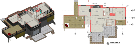
The order of drawings in the dinky House drawing set is pretty typical. It begins with the site plan, which locates the house on the site and shows the site development. Then come the plans, which are horizontal slices through the house. They include general floor plans, dimensioned floor plans, reflected ceiling plans, and a roof plan. Next, the exterior elevations illustrate what the completed house looks like from every direction. Then come the building sections, which are vertical slices through the house. I have eight cross sections and three longitudinal sections. Interior elevations follow, and illustrate appearance of every wall that is significant in some way, perhaps due to its shape, unique wall finishes, or because they contain cabinetry or built-ins. Next, schedules are included to further describe doors, windows, finish materials, plumbing fixtures, appliances, and toilet accessories. Then there are details, lots of details! Structural drawings come after details and illustrate how the house goes together. They consist of a foundation plan, floor framing plans, and roof framing plans. Unless the house allows for a really simple heating, ventilation, and air conditioning system, I normally provide mechanical plans. (Spoiler alert: the dinky House has a mechanical plan.) Electrical drawings complete the drawing set. They contain power plans and lighting plans for the house and site.
The project manual is the often forgotten part of the construction documents. At least for me, these are not fiil-in-the-blank or boiler plate documents. They are specifically tailored to the house, just as the drawings are. They contain information regarding procurement, a bid form, requirements for the builder and his subs, and technical specifications for virtually every material and system in the house and site. Contractually they carry even more weight than the drawings. Should they be in conflict with the drawings, they take precedence. In the case of the dinky House, I ended up with 41 pages in the project manual, not including the contract. More on that in the next issue.
After the intense effort of the construction documents phase, we are ready to find out what it will actually cost to construct the house, and hopefully engage in the steps to get construction underway. We’ll pick up there in the next issue – procurement: LET’S GO!.
BONUS Material:
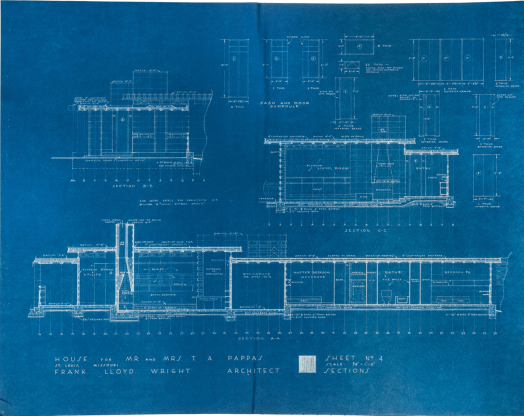
Blueprints are the physical sheets of drawings generated using a contact print process that results in blue sheets with white lines. It’s basically a negative image. If you’ve seen original construction drawings by an early 20th century architect, you’ll immediately recognize them as blueprints. Blueprints were the common reprographic technique used back then, but it is an old technique and has long since fallen out of favor. For a while the profession used what were called blue line drawings, or whiteprints – blue lines on white paper. They were easier to read and allowed the architect to make notes directly to them. Most architectural drawings these days are reproduced more like a photocopy – black lines on white paper. Our firm sometimes uses color prints, which I think will become increasing commonplace. It allow us to increased flexibility in how to illustrate our design intent to the client and builder.
blueprint of Frank Lloyd Wright’s Pappas House
Like many words, the definition of blueprint has evolved. What I’ve been describing as construction drawings are just a pumped up version of what many think of as blueprints.. Architects don’t really use the term, unless they are actually referring to a very old drawing that actually is a blueprint. In fact, about the only time we hear blueprint mentioned is when someone is on the phone asking, “How much would you charge me to draw up some blueprints?” …..There are so many things wrong with that question that it’s difficult to know how to begin answering it! Now, perhaps, I can just refer them to weshapespce.com.
“Design is not just what it looks like and feels like. Design is how it works.”
-Steve Jobs, founder of Apple
I really appreciate this quote by Steve Jobs. His comment about design in general could be said of architecture specifically. It succinctly describes the first two phases of architectural service. If the schematic design phase determines “what it looks and feels like”, then the design development phase determines “how it works”.
In this post we’ll delve into how it works. Design development is the second of the five phases of service that architects typically provide. Using the dinky House as a case study, we’ll explore the architect’s process, or at least my process. In this phase we advance the plans, more precisely place the house on the site, select the primary building materials, and decide on the major building systems. My toolbox containing paper and pens is supplemented during this phase, and computer modeling is added.
space plan at the end of design development
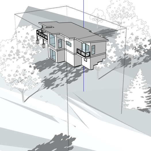
I use the information gathered from the schematic design phase to produce a basic model of the house, and I gather whatever site information I have to build a basic model of the site. With that, I can more precisely locate the house on the site, as a 3d object on a 3d site. I can move and rotate the house to get it to both the right location and at the optimal elevation. Sometimes this is tweaked in the field but this technique yields pretty good results. In the case of the dinky house I commissioned a topo of the building area, as determined in the schematic design phase, made the models, and then played around with them for a while. There was a 75′ front yard setback imposed by the HOA. I also knew I had to work outside of the floodway, which extended to the dinky line. Otherwise, the placement of the house on the site was determined by architectural and logistical reasoning.
house to site placement
Architecturally I wanted the house to be ofthe hill, and not on the hill (FLW would be proud!), so I planted it in the bank of the hill. I positioned the house to gather the best views possible, short of clear cutting to the river. We were content with view corridors during the summers, until the fall begins to thin out the woods. But views are not everything. One of the cool things about the dinky site are the soothing sounds of the river rolling over the nearby shoals. So we positioned the house to maximize our sensory enjoyment of nature.
Logistically, the house needed to parallel the contours to minimize sitework. The contours suggested that the facade facing the river be oriented Southeast. Knowing that the best passive solar orientation would be South, I twisted it a bit to get it closer to South, while still straddling the contours. Easy access to the jobsite area, and later parking, was available on the north side. Utilities were also located on the north side, except that city sewer was not available. The logical place for a septic tank and drainfield was on the low-slope east portion of the site.
The house model is a great tool for exploring exterior materials. I typically like to mix a couple of different facade treatments. For cost and ease of maintenance it’s hard to beat fiber cement lap siding. So I began with that but I was not sure what to pair it with. After considering a lot of options, I decided to leave it open for the moment, to allow for additional study. (Sidenote: The design development phase advances the design, but it is not necessary to know everything about the materials and systems at this stage. It’s okay for some things to remain undecided, or even change, as the project develops.) The low sloped shed roof really called for a metal roof. I’ve always liked the corrugated metal roofs that cap so many rural barns, and decided to use it. The exposed structural components are painted wood. The deck boards, ceilings, and soffits are sealed wood.
Then there are the interior materials. As opposed to many cabins lined with heavy stained wood walls, I chose to use drywall. I have found that it can be a sculptural material that can also be light and airy. I did use some wood paneling but it is painted and used only in a couple of targeted locations. I’ve always liked strip oak wood floors and decided to use them throughout the main floor. Luxury vinyl tile is used throughout the lower floor for its durability and the variety of colors and patterns. The ceilings are a combination of drywall (mostly on the flat ceiling) and sealed plywood (mostly on sloped ceilings), providing continuity between the inside and the outside.
The structural systems is conventional for the most part, consisting of concrete footings, a basement floor slab, CMU basement walls, and wood framed floors and roofs . The walls however are SIPS, a sort of sandwich panel of sheathing and foam. When used with spray foam and rigid insulation board on the roof, these materials provide a very efficient thermal envelope. The heating and air conditioning design utilize high efficiency mini-splits, supplemented with an ERV/dehumidifier and exhaust fans to keep the air fresh in the tight thermal envelope. The plumbing system is conventional except that it feeds primarily WaterSense fixtures and fittings. Hot water heater is heated in a simple high efficiency tank and recirculated by a pump for “on demand” control. The electrical system is also fairly conventional, and powers a combination of LED light fixtures and ceiling fans.
systems exploration includes structural, HVAC, and electrical
Knowing what it looks and feels like, as well as how it works, we are now ready to advance to the next phase…..and the next blog post. Be on the lookout for – construction documents: BLUEPRINTS.
BONUS Material:
With commercial projects, Architects quarterback a whole team of professionals, including civil engineers, landscape architects, interior designers, structural engineers, mechanical (plumbing & HVAC) engineers, and electrical engineers. That is not the case for the average custom home. Architects often perform at least an abbreviated version of the tasks carried out by most of these design professionals. Sometimes an Owner will retain a landscape architect. or an interior designer, and sometimes an Architect will retain an engineer for a limited scope of work.
On the dinky project I was comfortable handling just about every task, with one exception – color selection. If you visit my current house, you may ascertain that my favorite color is white. I love the clean, crisp feel of white surfaces, as well as the play of shadow and light that white surfaces enhance. Susan too has a fondness for white……or so I thought, until she requested “a little color” both in and out at the dinky. I suddenly felt deficient. Fortunately I knew a couple of exceptional interior designers who had done a masterful job on a couple of the firm’s custom homes. So Susan and I worked with The Design Collaborative to select the right colors. They also had some great ideas pertaining to materials and textures, ideas which took the project to the next level. Thank you Heather and Hannah!
“A free-hand sketch, with all its imperfections, often opens a dialogue, invites users to participate in the process and suggests with welcoming arms that nothing’s set in stone.”
– David Drazil, Architect and Author
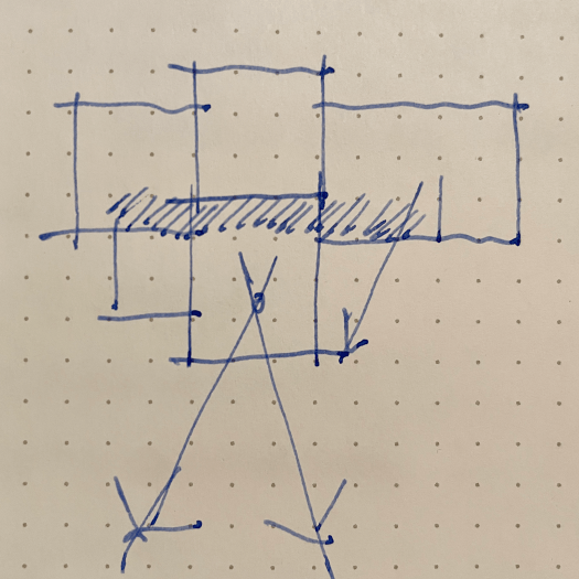
Parti’ diagram developed for “the dinky“
The selection of the architect may be the most consequential decision you will make once you decide to build your house. Don’t take it lightly. As with the site selection, do your due diligence. Some hire their architect based solely on fee. This is a mistake. A low fee equates to a reduced scope of work, which then leads to an inferior final product. A good architect will put a ton of blood, sweat, and tears into your project. This is reflected in the fee. For a serious architect to perform full services on a single family detached home, expect to pay 8 to 12 percent of the construction cost, maybe more if it’s an addition and alterations project or is very small or complex. (For a brief overview of the effort involved, reference Phases of Architectural Sevices.) So ask around. Look at websites and social media. Interview. The goal should be to find someone with whom you have a good rapport and whose work you admire.
In this post we’ll talk about the first of the five phases of service that architects typically provide – schematic design. Using the dinky House as a case study, let’s take a look at the process. I’ll be describing my particular process, which has evolved (and continues to evolve) based on my ideas of architecture, my working knowledge, and my skillset in conveying architectural form. There is no standard process that all architects follow. I’ve developed and refined my process over four decades of continuous practice. During the schematic design phase, I use the most basic of architectural tools – pen and paper. I address this in more detail in the architecture connection blog, architecture + SKETCHING: Drawing on Imagination, but basically I feel that freehand sketching is the most intuitive and direct way to get ideas out of my head and onto paper. After all, ideas stuck in the head of an architect never get seen by a client or built by a contractor. Eventually seeing designs conceived in my head later realized in built form is, for me, the most gratifying part of being an architect. Enough architalkure. Now, back to my schematic design process.
spacial program
Before I even start drawing, I work with the client to flesh out the program. What are the rooms and spaces desired? How do they relate to each other? What is their function. Where should they be positioned relative to sun, views, neighbors? What if any limitation are posed in getting the car on site? Once I have the list of spaces, I draw them to scale as simple rectangles, something I’ve dubbed a spacial program. This gives me a good graphic representation of what I’m dealing with. I can also add up the square footage, add some for circulation, and get a rough estimate of the square footage requirements. Multiplying that by an estimated square foot cost gives me and my client a pretty good idea of the funds that will be required to meet the program requirements. With that, we know if we can play loose with the design and not worry if it grows a bit, or do we need to try and make it stealthy, using shared spaces and other tricks? The last thing either of us want to do is to invest a large amount of time and energy into a design we both love, and then have a builder bid it and tell us that it has blown the budget. This scenario can play out under any circumstances, but I try to lessen the odds by starting out being as realistic as I can be.
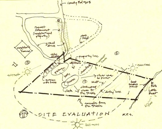
site evaluation
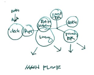
bubble diagram of main floor
I next develop simple bubble diagrams to evaluate the site and house, showing spacial relationships without regard to scale, shape, or location. A space planning exercise follows, where all of the spaces are arranged in basic shapes, drawn to scale. The effect is almost a floor plan, but simpler , with no doors or windows. These diagrams illustrate spaces and their adjacencies to each other as well as to site features. It allows the client to focus on the relative size of the spaces and their relationships to each other without the distractions of a developed plan. With all of this accrued knowledge, I can now begin to develop what most clients recognize as architectural drawings – plans and elevations. I often start these as small scale drawings. I produce quick sketches on tracing paper, lay them over more quick sketches to advance them, and I do this over and over and over, until I finally get the design to a good stopping point that I can show the client. Figuring out exactly where to stop is hard because these sketches are never really completed to my satisfaction. It is normally the constraint of time that forces me to stop designing and put something presentable on paper.
space planning diagram
The program I originally generated for a single story fishing cabin included a Foyer, Living Area, Eat-in Kitchen, Guest Bedroom, Primary Bedroom, and a large Bath, which doubles as the Laundry. As I’ve already mentioned, my wife and client, prompted the downstairs “Dormitory” which was comprised of a Sitting Area, Sleeping Area, and a Bath.
We can hear the soothing sounds of the shoals on the west side of the site, so we placed the entrance and deck where it can be experienced by anyone who enters the house. The house is linear and logically parallels the contours but is twisted to face a little east of south to capture views of the river. The north and especially the south sides of the house contain several large windows, strategically placed to frame views and allow for cross ventilation. The Foyer orients the visitor to the interior and leads to the “public” areas, comprised of the Eat-in Kitchen and the Living Area, projecting up and out to the southern vistas. The Primary Bedroom is opposite the Foyer, past the Stair and Bath, on the more private east end of the house and site. A small balcony off the Primary Bedroom allows views to the southeast, down to the river. The Primary Bedroom contains, as Frank Lloyd Wright would say, a place to nest and a place to perch (as further explained in the architectureconnection post Nesting & Perching.)
As opposed to what many think, the process of getting from the program to plans and elevations is very much an evolutionary one. I go through dozens, sometimes hundreds of sketches and overlays, developing and arranging rooms and spaces, and block out elevations and character sketches with numerous variations. It’s not easy to shape space! I try to work on both the plans and elevations together. After all, they are just different views of the same design. I never want to “finish the plan” and have to force elevations onto it. Ancillary to this process is the site plan, which also evolves along with the plans and elevations. My sketches tend to get increasingly more refined as the design evolves. Eventually I am able to complete the schematic design process. There is sometimes a fuzzy line between the phases of the architect’s work, but with solid preliminary floor plans, a couple of character sketches, and a well developed site plan, the schematic design phase is considered complete. The design will no doubt change as we move to the next phase, design development, but the DNA is pretty well set.
Once the architect and client agree that the floor plans convey the approiorate rooms, spaces and relationship, and that the elevations convey the desired general massing and style, and the site plan properly places the building and allow good vehicular access, it is time to move on to the next phase. That’s where we’ll pick up in the next issue – design development: How it Works.
preliminary floor plans
character sketches
What about the parti’? Let me explain. Archisoup defines a parti’ diagram as “a simple sketch that communicates the overall concept for a design project.” I can’t speak for others, but I never sit down with the expressed purpose of drawing a parti’ diagram; however, I can usually go back through my sketches and find it after-the-fact. The first image at the top of this post is one of the first sketches I drew. This parti’ diagram is a simple but important sketch that I recently found, amazingly, in one of my sketchbooks. (See Bonus Material.) Had I not found it, this blog post title “Parti’ Time” would make little sense. My parti’ diagram captures the “big idea” – a collection of spaces along a circulation spine, arranged to allow distant vistas. All of the diagrams and sketches developed in the schematic design phase are just stems, leaves, and petals sprouting from that seed.
BONUS Material:
I have long admired architects and designers that are able to use sketchbooks like diaries – regularly logging entries. Once I was out of college, where we were often required to keep sketchbooks, I pretty much abandoned the practice. I really do like the idea of having all my sketches for a particular project in one place, where I can reference and track its evolution, Unfortunately it does not work for me as a practical matter. That’s why there are so many different looking sketches in this post.
Perhaps the main reason I don’t keep a sketchbook is that it is never around when I need it. (I know deep inside that the problem lies with me, not my sketchbook.) I normally work down to the last possible moment, so the last thing I have time to do is to start a sketchbook search. I can easily grab one of several notebooks or rolls of tracing paper that are alway laying around my drawing table and scattered throughout the studio.
I also have a weird obsession with pens and paper. They are not all the same. (Sorry, but I have to geek out for minute.) I normally prefer a medium nib Lami Safari fountain pen on 12 inch wide canary tracing paper. I like white tracing paper if I’m going to be “coloring” with my Design markers. I also love Pilot Precis V5 and V7 pens – black for drawing and red for, well, red-lining. I also like the trusty #2 pencil. It is still as versatile and expressive as ever.
my current sketchless book
I draw a good bit outside the office – at jobsites, at home, in coffee shops, in restaurants, and while driving (just kidding)! In these scenarios, I usually still have one of my Lamys or Precise pens, but I replace my tracing paper with pieces of drywall or 2x4s, product manufacturer’s notepads, ruled notebook paper, napkins, the back of receipts, or whatever else I might find. When not in the office I am forced to be far less picky.